





App Store screenshots: the 10 things we check in every teardown

the short version
- In App Store search results people see only your first few screenshots, so those carry the whole page. Lead with the hero moment, never the login screen.
- One idea per frame, a caption of two to six words, and real UI filled with believable content.
- Read the captions in a row: they should make a sentence. Then check the whole set at thumbnail size on an actual phone.
- Once you’re live, test alternatives with App Store Connect’s product page optimisation instead of arguing about them.
In this post13 sections
- 1. The first three do the selling
- 2. One idea per frame
- 3. Captions you can read at thumbnail size
- 4. Real UI, real content
- 5. A tidy status bar
- 6. The set tells a story, in order
- 7. One consistent look
- 8. Don't hide the app
- 9. Every size, every language
- 10. The icon and the first frame agree
- Bonus: the app preview
- Then stop arguing and test
- The checklist
App Store screenshots are the most looked-at design work most apps will ever ship, and they’re usually made at 11pm the night before submission. We look at a lot of them, because the screenshots are the first thing we check in every free teardown.
Here’s the checklist, in the order we go through it. Don’t worry if yours fails a few: every one of these is fixable in an afternoon.
1. The first three do the selling
In App Store search results, people see your icon, your name, your subtitle and the first few screenshots (three portrait ones, or one landscape, or your app preview if you have one). Plenty of people never open your product page at all. They decide from that row.
So the first three frames are a poster, not a manual. The first one should show the hero moment, the thing that makes your app worth having, as big and clear as you can make it. Not the login screen. Not a settings page. Not a collage of eleven features.
2. One idea per frame
Each screenshot gets one job. One screen, one caption, one idea. If you need the word “and” in the caption, it’s probably two screenshots.
Write captions about what people get, not what the feature is called. “Know what’s in your fridge before you shop” beats “Inventory management”. “Your week, planned in one tap” beats “Smart scheduling”. Nobody downloads a feature name.
3. Captions you can read at thumbnail size
This is the easiest one to get wrong. Captions are designed on a 27-inch monitor and read on a 6-inch phone, shrunk to a third of the screen.
Our rules of thumb: two to six words, big and bold, high contrast against the background, and nothing important in the bottom quarter where it’ll compete with the UI. Then do the test.
4. Real UI, real content
Show the actual app with believable content in it. No lorem ipsum, no “John Doe”, no empty states, no placeholder grey boxes. If your app is a food diary, fill it with real-looking meals. If it’s social, use names and photos that look like actual people (with permission, or clearly fictional).
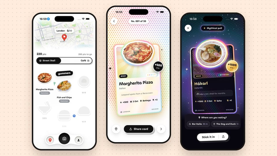
Filled-in UI does two jobs: it shows what the app does, and it shows what your life looks like with it. An empty app shows neither.
5. A tidy status bar
9:41, full signal, full battery, no notifications. It’s a small thing that makes a set look finished, and a 4% battery icon in the corner makes it look like a hurried screen recording (which it probably was).
If you’re capturing from the iOS Simulator, you don’t need to fake it in Figma. One command sets it for you:
xcrun simctl status_bar booted override --time "9:41" --batteryState charged --batteryLevel 100 --cellularBars 4 --wifiBars 3On a real device, capture with Do Not Disturb on and fix the bar in your design file before export.
6. The set tells a story, in order
Read only the captions, left to right. They should make a sentence, or at least a sensible little story: the hook, how it works, the detail that makes it yours, who it’s for.
A pattern that works for most consumer apps:
| Frame | Job | Example caption |
|---|---|---|
| 1 | The hero moment | “Collect every dish you eat” |
| 2 | How it works | “Snap it. Score it. Keep it.” |
| 3 | The fun bit | “Rare finds are worth more” |
| 4 | The social bit | “Share your best pulls” |
| 5 | The detail | “Every place you’ve eaten, on one map” |
| 6+ | Reassurance | Privacy, offline, widgets, whatever people worry about |
(Those captions are made up for illustration, before anyone asks.)
You can upload up to ten screenshots per device size. You don’t have to use all ten. Six great ones beat ten where the last four are filler.
7. One consistent look
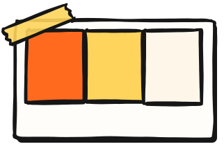
The set should feel like a family: the same type, the same background system, the same device treatment (or no device frame at all), the same caption position. Pull the colours from your icon so the set and the icon look like they came from the same company, because they did.
A useful test: put your screenshots, your icon and your landing page side by side. If a stranger couldn’t tell they belong together, the set needs another pass.
8. Don’t hide the app
The opposite failure to number 4: huge marketing backgrounds, a tiny phone in the middle, and the actual UI the size of a postage stamp. The UI is the product. Let it be big.
You’re allowed to cheat. Zoom into the part of the screen that matters. Let the phone frame bleed off the edge. Pull one card out of the UI and float it above the rest. The rule is that what you show must be real and in the app, not that it has to sit politely inside a frame.
9. Every size, every language
Sizes: Apple asks for screenshots at the largest iPhone display size and scales them down for smaller phones, plus iPad screenshots if your app runs on iPad. Check the current spec in App Store Connect before you export, because the sizes change every couple of years. Then preview how the set looks on a smaller phone, where your carefully balanced caption may get uncomfortably tight.
Languages: If a real share of your users are in another country, localise the captions. The screenshots are the copy, and English captions on a Japanese storefront are a quiet way of saying “not for you”.
Android: Google Play takes up to eight phone screenshots and wants a 1024×500 feature graphic as well. Don’t just reuse the iOS set with an iPhone frame in it. Android people notice, and it looks lazy.
10. The icon and the first frame agree

We review the icon alongside the screenshots, because in search results they sit next to each other. Does the icon read at its smallest size? Does it still work on a busy wallpaper, and in dark and tinted modes? Does it look like the same app as screenshot one?
If your icon is a blue gradient and your first screenshot is a pink illustration, people have to work out that they’re the same thing. Don’t make them work.
Bonus: the app preview
An app preview is a short video (up to 30 seconds, and you can have up to three) that plays muted in place of your first screenshot. Treat it like your first frame: the hero moment in the first couple of seconds, captions that work without sound, and a poster frame that works as a still. It’s a different cut from your launch film, and it should be made of footage from the app itself.
Then stop arguing and test

Once you’re live, App Store Connect’s product page optimisation lets you test alternative screenshots, previews and icons against your original with real traffic. It’s the best way to end a debate about whether frame one should be the map or the card: put both up and let the store decide.
The checklist
If your set fails more than a few of these, our App Store screenshots package (a full set plus an icon review, one week, from £1,500) is on the menu. Or ask for a free teardown and we’ll mark up your current set for nothing.