





the short version
- The headline is one sentence a stranger can repeat: what the app does, and who it’s for. If you need a second sentence to explain the first, the first isn’t done.
- The hero is four things and no more: that sentence, the hero moment, one action, and a way to leave an email if they aren’t ready.
- Only use proof you actually have. A made-up user count on day zero fools nobody, including the people you most want.
- Read the line out loud to someone who has never seen the app. If they ask what it does, rewrite it.
In this post6 sections
Most landing pages for new apps open with a mood. A gradient, a slogan, three floating phones, and a headline that could belong to any of them. “The future of productivity.” “Your life, organised.” “Work, beautifully.”
None of those tell a person what happens if they tap the button.
The hero has one job: in the time it takes to decide whether to scroll, say what the app does, who it’s for, and what to do next. One line can do the first two. This is how to write that line, and what is allowed to sit next to it.
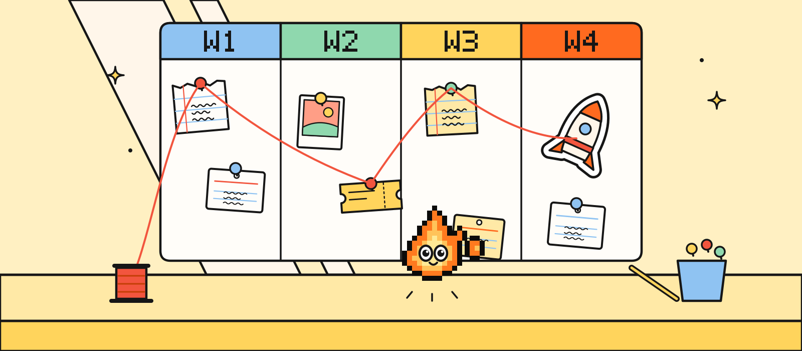
The four-week launch plan gives the landing page a paragraph in week two. This is the page itself.
The sentence is the whole page
Write the sentence before you open a design file. If the team can’t agree on it, the layout will paper over the argument with a bigger illustration, and the argument will still be there on launch day.
The sentence has two parts:
- What it does, in words a person would use, not the name of a feature.
- Who it’s for, specifically enough that the wrong person feels gently excused.
“X for Y” is a fine shape. “A shared fridge list for flatmates who are tired of buying milk twice” is a sentence. “Next-generation household inventory” is a category.

If a stranger can’t repeat the line after one read, it isn’t a headline. It’s a riddle.
A few tests, in order. Stop at the first one you fail.
- The mum test. Read it to someone who doesn’t work on the app. Can they say it back, roughly, without looking?
- The swap test. Could a competitor paste your line onto their page and have it still be true? If yes, it’s a category, not a product. Add the specific thing.
- The “and” test. If the line needs “and” to hold a second idea, you have two pages, or you haven’t picked. Pick.
- The search test. Would someone type a version of this line into a store or a search box? If the words are ones only your team uses, they won’t.
How to write it in an afternoon
Don’t start from a blank box. Start from the hero moment: the one screen where a new person goes “oh, nice”. The four-week plan is where that moment gets chosen. The headline names the outcome of that moment, not the screen.
Try this on paper. Four lines, then cross three out.
1. What someone has in their hands after one good session
2. The annoying thing that session replaces
3. The specific person (not "everyone", not "18-35s")
4. The line: [2 or 1], for [3], in under twelve wordsTwelve words is a ceiling, not a target. Eight is often better. Under the line, one short supporting sentence is allowed: the how, or the catch, in plain words. If that supporting sentence is doing the real explaining, swap them. The clearer line wins, even if it’s less clever.
Words that almost always make a line worse: seamless, empowering, supercharge, unlock, revolutionise, “the smart way to”, and any sentence that starts with “Introducing”. Say the verb. Snap, split, plan, keep, send, collect.
The hero block, and nothing else
Once the sentence exists, the top of the page is a small pile. In order:
| Piece | Job | Keep it |
|---|---|---|
| The line | Say what it does and who it’s for | One sentence, big |
| The support | The how, or the limit, in one breath | Optional. One sentence |
| The hero moment | Show the thing the line just promised | A short loop of the real app, or one honest still |
| One action | Download, join the list, or book | One button. Store badges count as that one action |
| A way out | For people who aren’t ready to install | An email field, not a second campaign |
The hero moment is the same moment as in your screenshots and your film. If the page shows a different “wow” from the store, people feel the join. A looping clip of the real UI beats a static mockup, and a static mockup of the real UI beats an illustration of a phone that doesn’t exist. Fill it with believable content. An empty app looks broken, on a website as much as in a store.
One action means one. If you offer the App Store and Google Play, the two badges are one action wearing two coats. A “Watch the film” link can sit quietly beside them. A second button that says “Learn more” and scrolls two screens is a button for people who didn’t read the line. Fix the line.
What is allowed under the fold
Under the hero, earn the scroll. A simple order that works for most consumer apps:
- Three beats of how it works. Not twelve features. The same story your screenshot captions tell, if you read them in a row.
- The detail people worry about. Privacy, price, offline, who can see their stuff. One of these, handled in a sentence, does more than a feature grid.
- Proof you actually have. A founder’s name. A short clip. A line from a person you can name, with their permission. Nothing else.
- The action again. Same button, same destination.
We’re a new studio, and this site is our first public page. We didn’t invent a wall of quotes for it. You shouldn’t either.
Skip, unless you truly need them: a logo carousel of companies that “trust” you (you don’t have them yet), a pricing table with four tiers for an app that has one price, an autoplaying full-screen film with no pause, and a chatbot that opens itself.
Rewrites
These apps are made up, so nobody writes in to say we got their tagline wrong.
| Instead of | The line |
|---|---|
| “Redefining personal finance” | “See which flatmate actually owes you £37” |
| “AI-powered meal planning, reimagined” | “A week of dinners from what’s already in the fridge” |
| “The all-in-one platform for modern teams” | “A standup that writes itself from yesterday’s commits” |
| “Capture, organise and share your thoughts” | “Notes that turn into a to-do list before you forget them” |
| “Wellness, on your terms” | “A ten-minute wind-down that doesn’t ask you to journal” |
Notice what changed. The vague noun became a verb and a concrete thing. The audience got smaller. The promise got checkable: you can tell, after one use, whether the app did that.
A question can be the line, if the next sentence answers it. “Forgot who paid for the shopping?” only works if the support line says what the app does about it. A question on its own is a poster. A poster still needs a product.
The day you flip it live
The page has two states, and you should build both before the week of launch.
Before launch: the sentence, the hero moment, the action (join the list, or TestFlight), and a date if you have one you’re willing to keep.
Launch day: the same sentence, store badges that go to the real store listing, and the word “live” somewhere a person can see it without hunting. Check the badges on a phone that isn’t yours. A badge that 404s is a very expensive illustration.
Don’t redesign the page on the morning. Swap the action, check the links, and leave the sentence alone unless it’s wrong. If it’s wrong, you should have found out in week one, when changing a line was free.
Our landing page is one page, designed and built, ready for that traffic: one to two weeks, from £3,000, on the menu. It can be the only thing you buy.
If you want a second pair of eyes on the line before you design anything, book a free 15-minute call and read it to us. We’ll tell you whether a stranger could repeat it.